Posted :
A
TableLayout
is first of all a
LinearLayout with a vertical
orientation
, so the properties
of LinearLayout ,
such as weight , apply to a TableLayout .
layout_weight is just how the remaining free
space is divided .
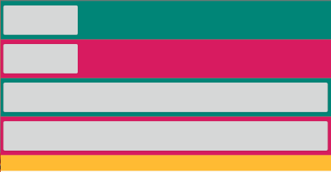
<?xml version="1.0" encoding="utf-8"?>

<TableLayout

    xmlns:android="http://schemas.android.com/apk/res/android"
    xmlns:tools="http://schemas.android.com/tools"
    android:layout_width="match_parent"
    android:layout_height="match_parent"
    tools:context=".MainActivity">

    <TableRow
        android:layout_weight="1"
        android:background="@color/colorAccent"/>

    <Button
        android:layout_weight="1"
        android:background="@color/colorPrimaryDark" />

    <TextView
        android:layout_weight="1"
        android:background="@android:color/holo_orange_light" />

</TableLayout>

A
TableLayout
can contain
0 or more
table rows , where a row can either be
a View or a
TableRow .
A View
such as
an ImageView , or a
Button will have a width
of MATCH_PARENT , and
a default height of WRAP_CONTENT .
The VIEW height can be changed .
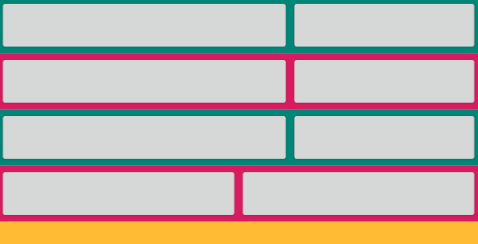
A TableRow is
a class which
extends LinearLayout , and
which has a horizontal orientation .
A TableRow width , is always set
to match its parent , as in MATCH_PARENT ,
and its height , is always set to wrap its content ,
as in WRAP_CONTENT .
A TableRow being
a LinearLayout , the
concept of weight
,
equally applies .
layout_weight
being how the
remaining free space is divided .
<?xml version="1.0" encoding="utf-8"?>

<TableLayout

    xmlns:android="http://schemas.android.com/apk/res/android"
    xmlns:tools="http://schemas.android.com/tools"
    android:layout_width="match_parent"
    android:layout_height="match_parent"
    tools:context=".MainActivity">

    <TableRow android:layout_weight="1"
              android:background="@color/colorAccent">

        <Button
            android:layout_gravity="center_vertical"
            android:layout_width="0dp"
            android:layout_weight="1"
            android:layout_height="wrap_content"
            android:background="@android:color/black"
            android:text="Button 1"
            android:textColor="@android:color/white" />

        <Button
            android:layout_gravity="bottom"
            android:layout_width="0dp"
            android:layout_weight="1"
            android:layout_height="wrap_content"
            android:background="@android:color/black"
            android:text="Button 2"
            android:textColor="@android:color/white" />

        <Button
            android:layout_width="0dp"
            android:layout_weight="1"
            android:layout_height="wrap_content"
            android:background="@android:color/black"
            android:text="Button 3"
            android:textColor="@android:color/white" />
    </TableRow>

    <TableRow android:layout_weight="1"
              android:background="@color/colorPrimaryDark" />

    <Button
        android:layout_weight="1"
        android:text="A Button"
        android:textColor="@android:color/white"
        android:background="@android:color/holo_orange_light" />

</TableLayout>

An added feature
of the Tablelayout
is the concept of cells and columns .
A cell is just a row's child .
A column is formed of cells in the vertical direction . The number of columns , is the max number of cells for all rows . The width of a column , is the largest width of its given cells , and the width of the cells in a column , will match the width of the column , unless weighting is being used .
<!-- Example three -->

<?xml version="1.0" encoding="utf-8"?>

<TableLayout

    xmlns:android="http://schemas.android.com/apk/res/android"
    xmlns:tools="http://schemas.android.com/tools"
    android:layout_width="match_parent"
    android:layout_height="match_parent"
    tools:context=".MainActivity">

    <TableRow android:background="@color/colorPrimary">
        <Button
            android:layout_width="250dp" />
        <Button
            android:layout_width="100dp" />
    </TableRow>

    <TableRow android:background="@color/colorAccent">
        <Button
            android:layout_width="0dp" />
        <Button />
    </TableRow>

    <TableRow  android:background="@color/colorPrimary">
        <Button
            android:layout_width="1dp"
            android:layout_weight="1" />
        <Button
            android:layout_width="1dp"
            android:layout_weight="1" />
    </TableRow>

    <TableRow android:background="@color/colorAccent">
        <Button
            android:layout_width="0dp"
            android:layout_weight="1" />
        <Button
            android:layout_width="0dp"
            android:layout_weight="1" />
    </TableRow>

    <TextView android:background="@android:color/holo_orange_light" />

</TableLayout>

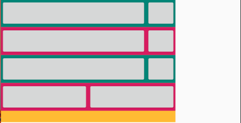
In
a TableLayout , the
android:collapseColumns
attribute can be
used to control if one or more columns
are to be collapsible
, hence hidden . This is done
by specifying the index of columns to be collapsed ,
separated by commas , as in android:collapseColumns="0"
or android:collapseColumns="0,3" .
So given the previous
example , if the column
at index 0
is set to be collapsible , as in :
<?xml version="1.0" encoding="utf-8"?>

<TableLayout

    xmlns:android="http://schemas.android.com/apk/res/android"
    xmlns:tools="http://schemas.android.com/tools"
    android:layout_width="match_parent"
    android:layout_height="match_parent"
    tools:context=".MainActivity"

    android:collapseColumns="0">

    <TableRow android:background="@color/colorPrimary">
        <Button
            android:layout_width="250dp" />
        <Button
            android:layout_width="100dp" />
    </TableRow>

    <TableRow android:background="@color/colorAccent">
        <Button
            android:layout_width="0dp" />
        <Button />
    </TableRow>

    <TableRow  android:background="@color/colorPrimary">
        <Button
            android:layout_width="1dp"
            android:layout_weight="1" />
        <Button
            android:layout_width="1dp"
            android:layout_weight="1" />
    </TableRow>

    <TableRow android:background="@color/colorAccent">
        <Button
            android:layout_width="0dp"
            android:layout_weight="1" />
        <Button
            android:layout_width="0dp"
            android:layout_weight="1" />
    </TableRow>

    <TextView android:background="@android:color/holo_orange_light" />

</TableLayout>
Then the new outcome in comparison to the older outcome , is :
A
column can also be
set as being stretchable
,
in its TableLayout , by using the
TableLayout attribute
android:stretchColumns . One
or more indexes can be specified , as in ,
android:stretchColumns="0" , or
android:stretchColumns="1,3" . In
such a case , the specified columns will be stretched to fill
the available empty space .
So if
example three is to be reconsidered
,
the column at index 1 is set to be
stretchable , as follows :
<?xml version="1.0" encoding="utf-8"?>

<TableLayout

    xmlns:android="http://schemas.android.com/apk/res/android"
    xmlns:tools="http://schemas.android.com/tools"
    android:layout_width="match_parent"
    android:layout_height="match_parent"
    tools:context=".MainActivity"

    android:stretchColumns="1" >

    <TableRow android:background="@color/colorPrimary">
        <Button
            android:layout_width="250dp" />
        <Button
            android:layout_width="100dp" />
    </TableRow>

    <TableRow android:background="@color/colorAccent">
        <Button
            android:layout_width="0dp" />
        <Button />
    </TableRow>

    <TableRow  android:background="@color/colorPrimary">
        <Button
            android:layout_width="1dp"
            android:layout_weight="1" />
        <Button
            android:layout_width="1dp"
            android:layout_weight="1" />
    </TableRow>

    <TableRow android:background="@color/colorAccent">
        <Button
            android:layout_width="0dp"
            android:layout_weight="1" />
        <Button
            android:layout_width="0dp"
            android:layout_weight="1" />
    </TableRow>

    <TextView android:background="@android:color/holo_orange_light" />

</TableLayout>
Comparing example three result , with the current result , yields :
A
column can also be
set to be shrinkable
,
in its TableLayout , by using
the TableLayout attribute ,
android:shrinkColumns , where
1 or more columns , separated
by a comma , can be specified , as in
android:shrinkColumns="1,4" .
In this case , the specified columns , will
shrink , to accomodate the TableLayout
width .
So if
example three is to be retaken
, and
if a width of 300dp is specified ,
with the android:shrinkColumns="1"
attribute being set , as follows :
<?xml version="1.0" encoding="utf-8"?>

<TableLayout

    xmlns:android="http://schemas.android.com/apk/res/android"
    xmlns:tools="http://schemas.android.com/tools"
    android:layout_width="300dp"
    android:layout_height="match_parent"
    tools:context=".MainActivity"

    android:shrinkColumns="1">

    <TableRow android:background="@color/colorPrimary">
        <Button
            android:layout_width="250dp" />
        <Button
            android:layout_width="100dp" />
    </TableRow>

    <TableRow android:background="@color/colorAccent">
        <Button
            android:layout_width="0dp" />
        <Button />
    </TableRow>

    <TableRow  android:background="@color/colorPrimary">
        <Button
            android:layout_width="1dp"
            android:layout_weight="1" />
        <Button
            android:layout_width="1dp"
            android:layout_weight="1" />
    </TableRow>

    <TableRow android:background="@color/colorAccent">
        <Button
            android:layout_width="0dp"
            android:layout_weight="1" />
        <Button
            android:layout_width="0dp"
            android:layout_weight="1" />
    </TableRow>

    <TextView android:background="@android:color/holo_orange_light" />

</TableLayout>
Then
in comparison to not setting
the
shrinkColumns
attribute , the result will be :
Since the number of columns in a row , is specified as being the max number of cells for all rows , what if what is needed , is to have some rows which have fewer cells , or in other words cells which span multiple columns ?
The answer to this question , is to use
the android:layout_span
attribute , as in
android:layout_span="2" ,
to specify the number of columns
a cell will span , which means
the number of columns a cell
will take .
A
cell always follows the natural flow of positioning , and it
can be positioned in a specific
column , using the
layout_column attribute , as
in android:layout_column="1" . So
in this example , it will be positioned in
column 1 .
An example
about the earlier 2
attributes is :
<?xml version="1.0" encoding="utf-8"?>

<TableLayout

    xmlns:android="http://schemas.android.com/apk/res/android"
    xmlns:tools="http://schemas.android.com/tools"
    android:layout_width="match_parent"
    android:layout_height="match_parent"
    tools:context=".MainActivity">

    <TableRow android:background="@color/colorPrimary">
        <Button
            android:layout_width="250dp" />
        <Button
            android:layout_width="100dp" />
        <Button
            android:layout_width="50dp" />
    </TableRow>

    <TableRow android:background="@color/colorAccent">
        <Button
            android:layout_width="0dp" />
        <Button />
    </TableRow>

    <TableRow  android:background="@color/colorPrimary">
        <Button
            android:layout_width="1dp"
            android:layout_weight="1" />
        <Button
            android:layout_width="1dp"
            android:layout_weight="1" />
    </TableRow>

    <TableRow android:background="@color/colorAccent">
        <Button
            android:layout_width="0dp"
            android:layout_weight="1" />
        <Button
            android:layout_width="0dp"
            android:layout_weight="1" />
    </TableRow>

    <TableRow android:background="@color/colorPrimary">
        <Button
            android:layout_column="1" />
    </TableRow>

    <TableRow android:background="@color/colorAccent">
        <Button
            android:layout_column="1"
            android:layout_span="2"
            />
    </TableRow>

    <TextView android:background="@android:color/holo_orange_light" />

</TableLayout>
The outcome of the previous xml code is as follows :

 Home
Home