Posted :
A
View has a set of attributes ,
such as its android:layout_width ,
or its android:layout_height .
Some of these
attributes are used
to customize the appearance of a view ,
this is called
styling the view
, or
applying a style to a given view .
This being said , a style can be defined inline , as in the following example :
<?xml version="1.0" encoding="utf-8"?>

<!-- activity_main.xml -->

<LinearLayout ... >

    <Button
        android:background="@android:color/holo_red_light"
        android:textColor="@android:color/white"
        android:focusable="false"
        android:clickable="false"
        ...
        android:layout_width="match_parent"
        android:layout_height="wrap_content"
        android:text="Button styled" />

</LinearLayout>

Or
if maybe it is
to create a model
, like
a button model ,
which will be applied to multiple button views ,
it can be defined in a resource file ,
located in the res/values folder .
The res/values folder
just contain some files , which
contain the definition of
some values , such as colors , or strings ,
or arrays of strings , or dimensions , or
styles .

Typically
styles are defined in a file named
style.xml
, but the file containing style definitions ,
can be named anything .
The styling resource file
,
starts with the
resources tag ,
and contain style tags , where
the style tags contain item
tags , used to define values for
some styling attributes .
The next
example
defines a text appearance style ,
and a button style :
<!--res/values/styles.xml-->

<resources>

    <style name="eccentric_appearance_text">
        <item name="android:textColor">@android:color/white</item>
        <item name="android:textColorHighlight">@android:color/black</item>
        <item name="android:textColorHint">@android:color/holo_blue_bright</item>
        <item name="android:textSize">22sp</item>
        <item name="android:textStyle">italic</item>
    </style>

    <style name="eccentric_button_style" >
        <item name="android:background">@android:color/holo_red_light</item>
        <item name="android:focusable">false</item>
        <item name="android:clickable">false</item>
        <item name="android:gravity">center_vertical|center_horizontal</item>
        <item name="android:textAppearance">@style/eccentric_appearance_text</item>
    </style>

</resources>
To apply styling to the button , this can be done where the button is defined like so :
<?xml version="1.0" encoding="utf-8"?>

<!-- activity_main.xml -->

<LinearLayout ... >

    <Button
        android:layout_width="match_parent"
        android:layout_height="wrap_content"
        style="@style/eccentric_button_style"
        android:text="Button styled" />

</LinearLayout>
What will happen , is that the view will parse the attributes specified using xml , and apply the specified styling .

A
theme
has some standard attributes
, which it must
provide values for , they are
defined in the sdk/platforms/android-{version-numer}/data/res/values/attrs.xml
file . For example , for android-30 , an excerpt of
the attrs.xml
file , is the following :
<!-- excerpt from sdk/platforms/android-30/data/res/values/attrs.xml -->

<declare-styleable name="Theme">
    <!-- ============== -->
    <!-- Generic styles -->
    <!-- ============== -->

    <!-- Specifies that a theme has a light background with dark text on top.  -->
    <attr name="isLightTheme" format="boolean" />

    <!-- Default color of background imagery, ex. full-screen windows. -->
    <attr name="colorBackground" format="color" />

    <!-- Color used for error states and things that need to be drawn to
            the users attention.. -->
    <attr name="colorError" format="reference|color" />

    <!-- Default background dim amount when a menu, dialog, or something similar pops up. -->
    <attr name="backgroundDimAmount" format="float" />

    <!-- =========== -->
    <!-- Text styles -->
    <!-- =========== -->

    <!-- Default appearance of text: color, typeface, size, and style. -->
    <attr name="textAppearance" format="reference" />

    <!-- The most prominent text color.  -->
    <attr name="textColorPrimary" format="reference|color" />
    <!-- Secondary text color. -->
    <attr name="textColorSecondary" format="reference|color" />
    <!-- Tertiary text color. -->
    <attr name="textColorTertiary" format="reference|color" />

    <!--  The underline thickness -->
    <attr name="textUnderlineThickness" format="reference|dimension" />

    <!-- ============= -->
    <!-- Button styles -->
    <!-- ============= -->

    <!-- Normal Button style. -->
    <attr name="buttonStyle" format="reference" />

    <!-- Small Button style. -->
    <attr name="buttonStyleSmall" format="reference" />

    <!-- Button style to inset into an EditText. -->
    <attr name="buttonStyleInset" format="reference" />

    <!-- ToggleButton style. -->
    <attr name="buttonStyleToggle" format="reference" />

    <!-- ============== -->
    <!-- Gallery styles -->
    <!-- ============== -->

    <!-- The preferred background for gallery items. This should be set
            as the background of any Views you provide from the Adapter. -->
    <attr name="galleryItemBackground" format="reference" />

    <!-- =========== -->
    <!-- List styles -->
    <!-- =========== -->

    <!-- The preferred list item height. -->
    <attr name="listPreferredItemHeight" format="dimension" />
    <!-- A smaller, sleeker list item height. -->
    <attr name="listPreferredItemHeightSmall" format="dimension" />

    <!-- The preferred TextAppearance for the primary text of list items. -->
    <attr name="textAppearanceListItem" format="reference" />
    <!-- The preferred TextAppearance for the secondary text of list items. -->
    <attr name="textAppearanceListItemSecondary" format="reference" />

    <!-- ============= -->
    <!-- Window styles -->
    <!-- ============= -->

    <attr name="windowBackground" format="reference|color" />
    <attr name="windowBackgroundFallback" format="reference|color" />

    <!-- ============ -->
    <!-- Floating toolbar styles -->
    <!-- ============ -->

    <attr name="floatingToolbarCloseDrawable" format="reference" />
    <attr name="floatingToolbarForegroundColor" format="reference|color" />
    <attr name="floatingToolbarItemBackgroundBorderlessDrawable" format="reference" />

    <!-- ============ -->
    <!-- Alert Dialog styles -->
    <!-- ============ -->

    <attr name="alertDialogStyle" format="reference" />

    <!-- ============== -->
    <!-- Image elements -->
    <!-- ============== -->

    <!-- Icon that should be used to indicate that an app is waiting for a fingerprint scan.
            This should be used whenever an app is requesting the user to place a finger on the
            fingerprint sensor. It can be combined with other drawables such as colored circles, so
            the appearance matches the branding of the app requesting the fingerprint scan.-->
    <attr name="fingerprintAuthDrawable" format="reference" />

    <!-- ============ -->
    <!-- Panel styles -->
    <!-- ============ -->

    <!-- The background of a panel when it is inset from the left and right edges of the screen. -->
    <attr name="panelBackground" format="reference|color" />
    <attr name="panelMenuIsCompact" format="boolean" />
    <attr name="panelMenuListWidth" format="dimension" />
    <attr name="panelMenuListTheme" format="reference" />

    <!-- =================== -->
    <!-- Other widget styles -->
    <!-- =================== -->

    <!-- Default Checkbox style. -->
    <attr name="checkboxStyle" format="reference" />
    <!-- Default EditText style. -->
    <attr name="editTextStyle" format="reference" />
    <!-- Default Gallery style. -->
    <attr name="galleryStyle" format="reference" />
    <!-- Default GridView style. -->
    <attr name="gridViewStyle" format="reference" />
    <!-- Default ListView style. -->
    <attr name="listViewStyle" format="reference" />
    <!-- Default RadioButton style. -->
    <attr name="radioButtonStyle" format="reference" />
    <!-- Default Spinner style. -->
    <attr name="spinnerStyle" format="reference" />
    <!-- NumberPicker style. -->
    <attr name="numberPickerStyle" format="reference" />
    <!-- The CalendarView style. -->
    <attr name="calendarViewStyle" format="reference" />

    <!-- =================== -->
    <!-- Action bar styles   -->
    <!-- =================== -->

    <!-- Default style for tabs within an action bar. -->
    <attr name="actionBarTabStyle" format="reference" />
    <!-- Reference to a style for the Action Bar Tab Bar. -->
    <attr name="actionBarTabBarStyle" format="reference" />
    <!-- Reference to a style for the Action Bar Tab text. -->
    <attr name="actionBarTabTextStyle" format="reference" />

    <!-- =================== -->
    <!-- Action mode styles  -->
    <!-- =================== -->

    <!-- Reference to a style for the Action Mode. -->
    <attr name="actionModeStyle" format="reference" />
    <!-- Reference to a style for the Action Mode close button. -->
    <attr name="actionModeCloseButtonStyle" format="reference" />
    <!-- Background drawable to use for action mode UI. -->
    <attr name="actionModeBackground" format="reference" />

    <!-- =================== -->
    <!-- Preference styles   -->
    <!-- =================== -->

    <!-- Default style for PreferenceScreen. -->
    <attr name="preferenceScreenStyle" format="reference" />
    <!-- Default style for the PreferenceActivity. -->
    <attr name="preferenceActivityStyle" format="reference" />
    <!-- Default style for Headers pane in PreferenceActivity. -->
    <attr name="preferenceFragmentStyle" format="reference" />
    <!-- Default style for PreferenceCategory. -->
    <attr name="preferenceCategoryStyle" format="reference" />
    <!-- Default style for Preference. -->
    <attr name="preferenceStyle" format="reference" />
    <!-- Default style for informational Preference. -->
    <attr name="preferenceInformationStyle" format="reference" />
    <!-- Default style for CheckBoxPreference. -->
    <attr name="checkBoxPreferenceStyle" format="reference" />

    <!-- ============================ -->
    <!-- Text selection handle styles -->
    <!-- ============================ -->

    <!-- Reference to a drawable that will be used to display a text selection
            anchor on the left side of a selection region. -->
    <attr name="textSelectHandleLeft" format="reference" />
    <!-- Reference to a drawable that will be used to display a text selection
            anchor on the right side of a selection region. -->
    <attr name="textSelectHandleRight" format="reference" />


    <!-- Theme to use for dialogs spawned from this theme. -->
    <attr name="dialogTheme" format="reference" />
    <!-- Window decor layout to use in dialog mode with icons. -->
    <attr name="dialogTitleIconsDecorLayout" format="reference" />

    <!-- Theme to use for alert dialogs spawned from this theme. -->
    <attr name="alertDialogTheme" format="reference" />
    <!-- Icon drawable to use for alerts. -->
    <attr name="alertDialogIcon" format="reference" />

    <!-- Style for button bars. -->
    <attr name="buttonBarStyle" format="reference" />

    <!-- Style for buttons within button bars. -->
    <attr name="buttonBarButtonStyle" format="reference" />

    <!-- Background to use for toasts. -->
    <attr name="toastFrameBackground" format="reference" />

    <!-- Background to use for tooltip popups. -->
    <attr name="tooltipFrameBackground" format="reference" />

    <!-- Foreground color to use for tooltip popups. -->
    <attr name="tooltipForegroundColor" format="reference|color" />

    <!-- ============== -->
    <!-- Pointer styles -->
    <!-- ============== -->

    <!-- The drawable for accessibility focused views. -->
    <attr name="accessibilityFocusedDrawable" format="reference" />

    <!-- ============= -->
    <!-- Color palette -->
    <!-- ============= -->

    <!-- The primary branding color for the app. By default, this is the color applied to the
            action bar background. -->
    <attr name="colorPrimary" format="color" />

    <!-- Dark variant of the primary branding color. By default, this is the color applied to
            the status bar (via statusBarColor) and navigation bar (via navigationBarColor). -->
    <attr name="colorPrimaryDark" format="color" />

    <!-- The secondary branding color for the app. -->
    <attr name="colorSecondary" format="color" />

    <!-- Bright complement to the primary branding color. By default, this is the color applied
            to framework controls (via colorControlActivated). -->
    <attr name="colorAccent" format="color" />

    <!-- The color applied to framework controls in their normal state. -->
    <attr name="colorControlNormal" format="color" />

    <!-- The color applied to framework controls in their activated (ex. checked) state. -->
    <attr name="colorControlActivated" format="color" />

    <!-- The color applied to framework control highlights (ex. ripples, list selectors). -->
    <attr name="colorControlHighlight" format="color" />

    <!-- The color applied to framework buttons in their normal state. -->
    <attr name="colorButtonNormal" format="color" />

    <!-- The color applied to framework switch thumbs in their normal state. -->
    <attr name="colorSwitchThumbNormal" format="color" />

    <!-- The color applied to framework progress and seek bar backgrounds in their normal state. -->
    <attr name="colorProgressBackgroundNormal" format="color" />

    <!-- The color applied to the edge effect on scrolling containers. -->
    <attr name="colorEdgeEffect" format="color" />

    <!-- =================== -->
    <!-- Lighting properties -->
    <!-- =================== -->

    <!-- @hide The default Y position of the light used to project view shadows. -->
    <attr name="lightY" format="dimension" />

    <!-- @hide The default Z position of the light used to project view shadows. -->
    <attr name="lightZ" format="dimension" />

    <!-- Alpha value of the ambient shadow projected by elevated views, between 0 and 1. -->
    <attr name="ambientShadowAlpha" format="float" />

    <!-- Alpha value of the spot shadow projected by elevated views, between 0 and 1. -->
    <attr name="spotShadowAlpha" format="float" />

</declare-styleable>
As
it can be seen from the attrs.xml file ,
some attributes are set to have a value , which has
a reference
format , meaning
it must refer to another
resource , other attributes are set to must have a literal
value , such as a boolean , or a dimension .
An example of a theme
, is the holo
theme ,which was the default system
theme , for application
targeting android api , from version
11 inclusive , till version 13 inclusive ,
and from which an exert is provided :
<!-- excerpt from sdk/platforms/android-30/data/res/values/themes_holo.xml -->

<?xml version="1.0" encoding="utf-8"?>

<resources>
    <style name="Theme.Holo">
        <item name="colorBackground">@color/background_holo_dark</item>
        <item name="colorError">@color/error_color_material_dark</item>
        <item name="backgroundDimAmount">0.6</item>

        <!-- Text styles -->
        <item name="textAppearance">@style/TextAppearance.Holo</item>
        <item name="textAppearanceInverse">@style/TextAppearance.Holo.Inverse</item>

        <item name="textColorPrimary">@color/primary_text_holo_dark</item>
        <item name="textColorSecondary">@color/secondary_text_holo_dark</item>
        <item name="textColorTertiary">@color/tertiary_text_holo_dark</item>

        <!-- Button styles -->
        <item name="buttonStyle">@style/Widget.Holo.Button</item>

        <item name="buttonStyleSmall">@style/Widget.Holo.Button.Small</item>
        <item name="buttonStyleInset">@style/Widget.Holo.Button.Inset</item>

        <item name="buttonStyleToggle">@style/Widget.Holo.Button.Toggle</item>

        <!-- Gallery attributes -->
        <item name="galleryItemBackground">@drawable/gallery_item_background</item>

        <!-- List attributes -->
        <item name="listPreferredItemHeight">64dip</item>
        <item name="listPreferredItemHeightSmall">48dip</item>
        <item name="textAppearanceListItem">?attr/textAppearanceLarge</item>
        <item name="textAppearanceListItemSecondary">?attr/textAppearanceSmall</item>

        <!-- Window attributes -->
        <item name="windowNoTitle">false</item>
        <item name="windowTitleSize">25dip</item>

        <!-- Dialog attributes -->
        <item name="dialogTheme">@style/Theme.Holo.Dialog</item>
        <item name="dialogCornerRadius">0dp</item>

        <!-- AlertDialog attributes -->
        <item name="alertDialogStyle">@style/AlertDialog.Holo</item>

        <!-- Presentation attributes -->
        <item name="presentationTheme">@style/Theme.Holo.Dialog.Presentation</item>

        <!-- Toast attributes -->
        <item name="toastFrameBackground">@drawable/toast_frame</item>

        <!-- Panel attributes -->
        <item name="panelBackground">@drawable/menu_hardkey_panel_holo_dark</item>
        <item name="panelMenuIsCompact">true</item>
        <item name="panelMenuListWidth">250dip</item>
        <item name="panelMenuListTheme">@style/Theme.Holo.CompactMenu</item>

        <!-- Widget styles -->
        <item name="checkboxStyle">@style/Widget.Holo.CompoundButton.CheckBox</item>
        <item name="editTextStyle">@style/Widget.Holo.EditText</item>
        <item name="galleryStyle">@style/Widget.Holo.Gallery</item>
        <item name="gridViewStyle">@style/Widget.Holo.GridView</item>
        <item name="listViewStyle">@style/Widget.Holo.ListView</item>
        <item name="listViewWhiteStyle">@style/Widget.Holo.ListView.White</item>
        <item name="radioButtonStyle">@style/Widget.Holo.CompoundButton.RadioButton</item>
        <item name="spinnerStyle">?attr/dropDownSpinnerStyle</item>

        <!-- Action bar styles -->
        <item name="actionBarTabStyle">@style/Widget.Holo.ActionBar.TabView</item>
        <item name="actionBarTabBarStyle">@style/Widget.Holo.ActionBar.TabBar</item>
        <item name="actionBarTabTextStyle">@style/Widget.Holo.ActionBar.TabText</item>

        <!-- Preference styles -->
        <item name="preferenceScreenStyle">@style/Preference.Holo.PreferenceScreen</item>
        <item name="preferenceActivityStyle">@style/PreferenceActivity</item>
        <item name="preferenceFragmentStyle">@style/PreferenceFragment.Holo</item>
        <item name="preferenceCategoryStyle">@style/Preference.Holo.Category</item>
        <item name="preferenceStyle">@style/Preference.Holo</item>
        <item name="preferenceInformationStyle">@style/Preference.Holo.Information</item>
        <item name="checkBoxPreferenceStyle">@style/Preference.Holo.CheckBoxPreference</item>

        <!-- Text selection handle attributes -->
        <item name="textSelectHandleLeft">@drawable/text_select_handle_left_material</item>
        <item name="textSelectHandleRight">@drawable/text_select_handle_right_material</item>

        <!-- Scrollbar attributes -->
        <item name="scrollbarFadeDuration">250</item>
        <item name="scrollbarSize">10dip</item>
        <item name="scrollbarThumbHorizontal">@drawable/scrollbar_handle_holo_dark</item>
        <item name="scrollbarThumbVertical">@drawable/scrollbar_handle_holo_dark</item>

        <!-- Search widget styles -->
        <item name="searchWidgetCorpusItemBackground">@color/search_widget_corpus_item_background</item>

        <!-- SearchView attributes -->
        <item name="searchViewStyle">@style/Widget.Holo.SearchView</item>
        <item name="searchDialogTheme">@style/Theme.Holo.SearchBar</item>

        <!-- PreferenceFrameLayout attributes -->
        <item name="preferenceFrameLayoutStyle">@style/Widget.Holo.PreferenceFrameLayout</item>

        <!-- NumberPicker style-->
        <item name="numberPickerStyle">@style/Widget.Holo.NumberPicker</item>

        <!-- CalendarView style-->
        <item name="calendarViewStyle">@style/Widget.Holo.CalendarView</item>

        <!-- TimePicker style -->
        <item name="timePickerStyle">@style/Widget.Holo.TimePicker</item>

        <!-- TimePicker dialog theme -->
        <item name="timePickerDialogTheme">?attr/alertDialogTheme</item>

        <!-- DatePicker style -->
        <item name="datePickerStyle">@style/Widget.Holo.DatePicker</item>

        <!-- DatePicker dialog theme -->
        <item name="datePickerDialogTheme">?attr/alertDialogTheme</item>

        <item name="colorPrimaryDark">@color/holo_primary_dark</item>
        <item name="colorPrimary">@color/holo_primary</item>
        <item name="colorAccent">@color/holo_blue_dark</item>
        <item name="colorEdgeEffect">?attr/colorPrimary</item>

        <item name="colorControlNormal">@color/holo_control_normal</item>
        <item name="colorControlActivated">@color/holo_control_activated</item>

        <item name="colorControlHighlight">@color/holo_button_pressed</item>
        <item name="colorButtonNormal">@color/holo_button_normal</item>
        <item name="colorSwitchThumbNormal">@color/switch_thumb_material_light</item>

        <!-- Holo-only color attributes -->
        <item name="colorPressedHighlight">@color/holo_gray_light</item>
        <item name="colorLongPressedHighlight">@color/holo_gray_bright</item>
        <item name="colorFocusedHighlight">@color/holo_blue_dark</item>
        <item name="colorMultiSelectHighlight">@color/holo_green_light</item>
        <item name="colorActivatedHighlight">@color/holo_blue_dark</item>

    </style>
</resources>
So
as it can be seen from the provided excerpt ,
a theme is also defined
using the style tag , in
a ressource file inside the res/values folder .
For the holo theme , this file is named themes_holo.xml .
In
a sense , the attributes which a theme defines ,
have a
higher degree of abstraction .
So for example , for button styling , the
buttonStyleSmall
attribute was specified
in the attrs.xml
file
, as to be
defined , and is
defined in themes_holo.xml , as having
the value of
@style/Widget.Holo.Button.Small .
@style/Widget.Holo.Button.Small
is defined in sdk/platforms/android-30/data/res/values/res/values/styles_holo.xml as :
<style name="Widget.Holo.Button.Small">
    <item name="background">@drawable/btn_default_holo_dark</item>
    <item name="textAppearance">?attr/textAppearanceSmall</item>
    <item name="textColor">@color/primary_text_holo_dark</item>
    <item name="minHeight">48dip</item>
    <item name="minWidth">48dip</item>
</style>
So
in other words , different themes can define different values for the
buttonStyleSmall attribute , and as an application
developper , if you want to
model by using themes
, you can
specify a
style
attribute for a View , for example the
button ,
by using style="?android:attr/buttonStyleSmall" ,
where
?android:attr/buttonStyleSmall
means , get the value of the android defined attribute , buttonStyleSmall ,
which is set , in the current set theme .
So whatever theme you set for your application , given the fact that you can also change a theme programmatically , or you can not specify a theme , to default to the device default theme , what is being stated is that in all cases , the button must have a styling of button small , so in other words , switching a theme , can switch the style while keeping the intended meaning , and going with the designer conceptions .
Also note that for example , the
buttonStyle ,
which is defined in a theme , as
<item name="buttonStyle">@style/Widget.Holo.Button</item>
, will be
applied by default to all
buttons ,
to which the theme is set for , for example in the activity ,
or in a viewgroup .
A
fallback theme , can be
specified for all the activities
in an application , by using
the AndroidManifest.xml
file . A theme can be specified for an activity ,
for a ViewGroup such as LinearLayout ,
for a specific View such as a Button .
<?xml version="1.0" encoding="utf-8"?>
<!-- AndroidManifest.xml -->
<manifest ...>
<application ...
android:theme="@style/AppTheme">
<activity
android:name=".MainActivity"
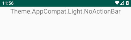
android:theme="@style/Theme.AppCompat.Light.NoActionBar" >
...
</activity>
</application>
</manifest>
<?xml version="1.0" encoding="utf-8"?>
<!-- activity_main.xml -->
<LinearLayout ...
android:theme="@android:style/Theme.DeviceDefault" >
<Button
...
style="?android:attr/buttonStyleSmall" />
<Button
...
style="@android:style/Widget.Holo.Button.Small" />
</LinearLayout>
Applying the theme at a higher level , will make it be inherited at a lower level . So a theme applied to an activity , makes it appliable to its root ViewGroup , if its root ViewGroup , does not specify a theme . The views children of the ViewGroup will also inherit its theme , if they do not specify their own .
In other words , if no theme is specified , higher levels are checked for a theme , if an activity does not specify a theme , the application fallback theme is used , if the application does not specify a theme , then the default theme is used .
The default theme is selected based on the default target sdk version :
If
the
target sdk is lower than
11 ,
which is HONEYCOMB , then the
default theme is com.android.internal.R.style.Theme ,
which is @android:style/Theme .
If
the
target sdk is larger or equal
to 11 , and
less than 14 , which is ICE_CREAM_SANDWICH ,
then the default theme will be com.android.internal.R.style.Theme_Holo ,
which is @android:style/Theme.Holo .
If
the
target sdk is larger or equal
to 14 ,
and less than 24 , which is android Nougat
, then the default theme will be com.android.internal.R.style.Theme_DeviceDefault
, which is @android/style/Theme.DeviceDefault .
For android platform 30 ,
this theme has a parent of Theme.DeviceDefaultBase ,
which has a parent of Theme.Material .
Theme.DeviceDefault
can be customized by device manufacturor ,
for example , on
older google nexus devices , Theme.DeviceDefault
was actually an alias to the Holo theme .
If
the
target sdk is larger or equal
to android version 24 , the
default theme is com.android.internal.R.style.Theme_DeviceDefault_Light_DarkActionBar
, which is @android:style/Theme.DeviceDefault.Light.DarkActionBar .
If multiple themes are assigned down the hierarchy , for example if one theme is assigned for the activity , a second one is assigned to the activity root ViewGroup , and a third one , on a View in that ViewGroup , then the most local one applies . Attributes which are defined in a higher level of the hierarchy , but which do not exist in the lower level , are also applied .
So
in other words , it is like
composing themes together
, and this brings us to what is called
overlay themes , which might be encountered
as in android:theme="@android:style/ThemeOverlay.Material.Light" .
Overlay themes ,
define a limited set of attributes ,
as to be composed with other themes .
<!-- sdk/platforms/android-30/data/res/values -->

<!-- Theme overlay that replaces colors with their light versions but preserves
        the value of colorAccent, colorPrimary and its variants. -->

<style name="ThemeOverlay.Material.Light">
    <item name="colorForeground">@color/foreground_material_light</item>
    <item name="colorForegroundInverse">@color/foreground_material_dark</item>
    <item name="colorBackground">@color/background_material_light</item>
    <item name="colorBackgroundFloating">@color/background_floating_material_light</item>
    <item name="colorBackgroundCacheHint">@color/background_cache_hint_selector_material_light</item>
    <item name="colorError">@color/error_color_material_light</item>

    <item name="textColorPrimary">@color/text_color_primary</item>
    <item name="textColorPrimaryInverse">@color/primary_text_material_dark</item>
    <item name="textColorSecondary">@color/text_color_secondary</item>
    <item name="textColorSecondaryInverse">@color/secondary_text_material_dark</item>
    <item name="textColorTertiary">@color/secondary_text_material_light</item>
    <item name="textColorTertiaryInverse">@color/secondary_text_material_dark</item>
    <item name="textColorPrimaryDisableOnly">@color/primary_text_disable_only_material_light</item>
    <item name="textColorPrimaryInverseDisableOnly">@color/primary_text_disable_only_material_dark</item>
    <item name="textColorHint">@color/hint_foreground_material_light</item>
    <item name="textColorHintInverse">@color/hint_foreground_material_dark</item>
    <item name="textColorHighlight">@color/highlighted_text_material</item>
    <item name="textColorHighlightInverse">@color/highlighted_text_material</item>
    <item name="textColorSearchUrl">@color/search_url_text_material_light</item>
    <item name="textColorAlertDialogListItem">@color/primary_text_material_light</item>

    <item name="textCheckMark">@drawable/indicator_check_mark_light</item>
    <item name="textCheckMarkInverse">@drawable/indicator_check_mark_dark</item>

    <item name="colorControlNormal">?attr/textColorSecondary</item>
    <item name="colorControlHighlight">@color/ripple_material_light</item>
    <item name="colorButtonNormal">@color/btn_default_material_light</item>
    <item name="colorSwitchThumbNormal">@color/switch_thumb_material_light</item>
    <item name="colorProgressBackgroundNormal">?attr/colorControlNormal</item>
</style>
The
AppCompat support library ,
which provides backwards compatibility for
older android versions , has some themes which are defined ,
and which start by Theme.AppCompat , or by
ThemeOverlay.AppCompat , and which can be
used as in android:theme="@style/Theme.AppCompat"
or as in style="?attr/buttonStyleSmall"
so without prefixing with android: , as in
to dereference an attribute which belongs or has
been defined by the application .
If an activity extends an AppCompatActivity ,
it must use an AppCompat theme .
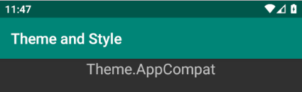
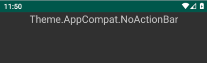
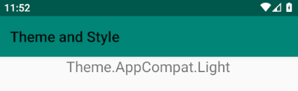
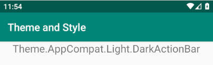
Generally in the android platform , or in AppCompat , the themes are either dark themes which use a dark bacground color , with a light foreground such as one used for text , or light themes , and they do , or do not have , an action bar . Light themes can also have a dark action bar .
There
is also what is called
a DayNight theme
, like
Theme.AppCompat.DayNight or
Theme.DeviceDefault.DayNight .
A DayNight theme switches between
a dark and a light theme , as instructed to do
by using the setDefaultNightMode
method , of AppCompatDelegate ,
as follows .
<!-- app/src/main/AndroidManifest.xml -->

<?xml version="1.0" encoding="utf-8"?>

<manifest ...>

    <application
        android:name=".TheApp"
        android:theme="@style/Theme.AppCompat.DayNight">
        <activity ...
    </application>

</manifest>
/* src/main/java/com/twiserandom/mobileapps/demo/theme_and_style/TheApp.java */

package com .twiserandom .mobileapps .demo .theme_and_style;

import android .app .Application;
import androidx .appcompat .app .AppCompatDelegate;

public class
        TheApp
            extends Application {

    public void
            onCreate ( ){
        super .onCreate ( );
        AppCompatDelegate .setDefaultNightMode (AppCompatDelegate .MODE_NIGHT_AUTO );
    /*
        MODE_NIGHT_AUTO_BATTERY :
            When battery saver is on , use the dark theme ,
            otherwise use the light theme .
        MODE_NIGHT_YES :
            use the dark theme .
        MODE_NIGHT_NO :
            use the light theme .
        MODE_NIGHT_AUTO , MODE_NIGHT_AUTO_TIME :
            use the dark theme , when determined by using
            the location or if not possible hardcoded time ,
            that it is night . This is deprecated .
        MODE_NIGHT_FOLLOW_SYSTEM :
            use the system night mode setting ,
            to determine if the dark theme is to be used . */ }}
A
DayNight theme
works by having values
for the night
category , defined in values-night , so for example
Theme.AppCompat.DayNight has values defined
in both
appcompat-version/res/values/values.xml as
<style name="Theme.AppCompat.DayNight" parent="Theme.AppCompat.Light"/> ,
and
appcompat-version/res/values-night-v8/values-night-v8.xml as
<style name="Theme.AppCompat.DayNight" parent="Theme.AppCompat"/> ,
values-night-v8 means
this applies
starting api version 8 only .
Starting
android version 10 ,
nicknamed Q , which is api version
29
, it is possible to set the phone theme to a
dark theme , by using system settings
, hence applications that uses
the day and night themes , will automatically switch to the
dark theme , unless they have this overriden , as shown earlier .
When an
android
application is created , it has a
default fallback theme
, declared in the AndroidManifest.xml .
<?xml version="1.0" encoding="utf-8"?>

<!-- app/src/main/AndroidManifest.xml -->

<manifest ... >

    <application ...
        android:theme="@style/AppTheme">
        ...
    </application>

</manifest>
AppTheme is defined
in the application
res/values/styles.xml ,
and has the following content :
<!-- app/src/main/res/values/styles.xml -->

<resources>

    <!-- Base application theme. -->

    <style
            name="AppTheme"
            parent="Theme.AppCompat.Light.DarkActionBar">

        <!-- Customize your theme here. -->

        <item name="colorPrimary">@color/colorPrimary</item>
        <item name="colorPrimaryDark">@color/colorPrimaryDark</item>
        <item name="colorAccent">@color/colorAccent</item>
    </style>

</resources>
So when defining a theme , or a style , a parent can be specified , as seen from the previous example , as not to start from scratch . For a style , it can be done like so :
<!-- app/src/main/res/values/styles.xml -->
<resources>
    <style
            name="eccentric_appearance_text"
            parent="@android:style/TextAppearance.Inverse">
            <!--
                To inherit from within the android platform
                sdk/platforms/android-version/data/res/values/styles.xml ,
                the @android:style/What_To_inherit format can
                be used .
                For example AppTheme can inherit the
                Theme.DeviceDefault.Light by using
                parent="@android:style/Theme.DeviceDefault.Light"
            -->
        <item name="android:textColor">@android:color/white</item>
        <item name="android:textSize">22sp</item>
        <item name="android:textStyle">italic</item>
    </style>

    <style
            name="eccentric_appearance_text.eccentric_button_style"
            parent="@style/eccentric_appearance_text" >
        <!--
            To inherit from within the
                application  , or within a library in the
                application such as AppCompat , the @android:
                prefix can be dropped  , you can even drop
                the @style/ if you want .
            So for example eccentric_button_style , can define
                a parent of parent="TextAppearance.AppCompat" ,
                to specify that its parent style belong to
                the AppCompat library .
            Also inheritance within the application , not within
                libraries that application is using , can be done
                using a dot notation in the name , of the like ,
                name="eccentric_appearance_text.eccentric_button_style" ,
                to specify that eccentric_button_style has a
                parent of eccentric_appearance_text .
                In such a case it is not necessary to use the
                parent attribute , but if the parent attribute
                is used , then the styling inherited using
                the parent attribute has higher precedence
                over styling inherited using the dot notation .
                When  specifying the style  , the complete
                dotted name must be used as in
                style="@style/eccentric_appearance_text.eccentric_button_style" -->
        <item name="android:background">@android:color/holo_red_light</item>
        <item name="android:textColor">@android:color/white</item>
        <item name="android:focusable">false</item>
        <item name="android:clickable">false</item>
        <item name="android:gravity">center_vertical|center_horizontal</item>
    </style>

</resources>
When
applying
android:theme
, and style to a view , the style
attributes will have a
higher priority than
the theme attributes
, and
inline attributes will have
a higher priority than both the theme ,
and the style attributes , and
styling attributes which are set programmatically ,
will have the
higher priority .
<?xml version="1.0" encoding="utf-8"?>

<!-- res/layout/activity_main.xml -->

<LinearLayout ... >

    <Button
            android:layout_width="match_parent"
            android:layout_height="wrap_content"
            android:id="@+id/btn"
            style="@style/eccentric_appearance_text.eccentric_button_style"
            android:theme="@android:style/Theme.Holo"
            android:textColor="@android:color/holo_green_dark"
            android:text="Button styled" />
        <!--
            Attributes defined in
            style="@style/eccentric_appearance_text.eccentric_button_style"
            have a higher priority than attributes
            defined in android:theme="@android:style/Theme.Holo"  ,
            but they have a lesser priority than  inline
            defined attributes  of the like of :
            android:textColor="@android:color/holo_green_dark" ,
            which have a lower priority of styling attributes
            set programmatically , as  in ,
            Button btn = (Button) findViewById(R.id.btn);
            btn.setTextColor(Color.BLUE); -->
</LinearLayout>
In
newer version of androd studio
, the
default fallback theme , declared in
AndroidManifest.xml ,
and which is used to customize
an application theming ,
had a
name change , and is now :
<?xml version="1.0" encoding="utf-8"?>
<!-- AndroidManifest.xml -->
<manifest ... >
    <application
        android:theme="@style/Theme.ThemeAndStyle">
        <!--
                The application name is actually
                Theme And Style , so ThemeAndStyle
                is the application name with spaces
                being removed . -->
        <activity  ...
    </application>
</manifest>
Theme.[ApplicationName]
is defined in
res/values/themes.xml
and res/values-night/themes.xml .
So one is the light theme , and the second
one is the dark theme .
<!-- res/values/themes.xml -->
<resources xmlns:tools="http://schemas.android.com/tools">
    <!-- Base application theme. -->
    <style name="Theme.ThemeAndStyle" parent="Theme.MaterialComponents.DayNight.DarkActionBar">
        <!-- Primary brand color. -->
        <item name="colorPrimary">@color/purple_500</item>
        <item name="colorPrimaryVariant">@color/purple_700</item>
        <item name="colorOnPrimary">@color/white</item>
        <!-- Secondary brand color. -->
        <item name="colorSecondary">@color/teal_200</item>
        <item name="colorSecondaryVariant">@color/teal_700</item>
        <item name="colorOnSecondary">@color/black</item>
        <!-- Status bar color. -->
        <item name="android:statusBarColor" tools:targetApi="l">?attr/colorPrimaryVariant</item>
        <!-- Customize your theme here. -->
    </style>
</resources>

<!-- res/values-night/themes.xml -->
<resources xmlns:tools="http://schemas.android.com/tools">
    <!-- Base application theme. -->
    <style name="Theme.ThemeAndStyle" parent="Theme.MaterialComponents.DayNight.DarkActionBar">
        <!-- Primary brand color. -->
        <item name="colorPrimary">@color/purple_200</item>
        <item name="colorPrimaryVariant">@color/purple_700</item>
        <item name="colorOnPrimary">@color/black</item>
        <!-- Secondary brand color. -->
        <item name="colorSecondary">@color/teal_200</item>
        <item name="colorSecondaryVariant">@color/teal_200</item>
        <item name="colorOnSecondary">@color/black</item>
        <!-- Status bar color. -->
        <item name="android:statusBarColor" tools:targetApi="l">?attr/colorPrimaryVariant</item>
        <!-- Customize your theme here. -->
    </style>
</resources>
As
seen
from the previous excerpt ,
Theme.[ApplicationName]
has a parent of Theme.MaterialComponents.DayNight.DarkActionBar
which is a new theme by google , defined in a new
library called
material components
, and which can be gotten by adding to the
build.gradle dependencies , the following
content :
dependencies {
    ...
    implementation 'com.google.android.material:material:<version>'
    // for example , implementation 'com.google.android.material:material:1.1.0'
    ...
}
The
material components library defines ,
a dark theme Theme.MaterialComponents ,
and a light theme Theme.MaterialComponents.Light , and a day and night
theme Theme.MaterialComponents.DayNight , which all can or cannot have an action
bar , as in Theme.MaterialComponents.DayNight.NoActionBar . Additionally ,
the day and night theme , and the light theme , can have a dark action bar , as in
Theme.MaterialComponents.Light.DarkActionBar .
The
material components library , also defines
what is called a bridge theme ,
this is like , if you were using in an older application ,
an AppCompat theme, and you want to switch the
theme to the new material component theme , but
some constraints forbid you of doing so , then you can
use a bridge theme as in Theme.MaterialComponents.Bridge .
Bridge themes inherit from
AppCompat
themes ,
and newer
theming must be explicitly enabled
, as not to cause attributes errors .
For bridge themes , there is
a dark and a light version , both with or without an
action bar . The light version can also have a dark action
bar .
<!-- res/values/themes.xml -->
<resources ...>
    <style
            name="Theme.ThemeAndStyle"
            parent="Theme.MaterialComponents.Bridge">
        <item
            name="materialButtonStyle">
                @style/Widget.MaterialComponents.Button
        </item>
        <!-- explicitly enabling newer theming  .-->
    </style>
</resources>
A theme as seen earlier , has a color palette , each application can customize it , as its branding sees fit . To understand how color applies to a theme , google has provided a color tool .

In
comparison with the older theming color attributes
specified in
AppCompat
, or the android api framework
used version , the material component library
colorPrimary
maps to
colorPrimary
, and
colorPrimaryVariant
maps to
colorPrimaryDark
,
and
colorSecondary
maps to
colorAccent
, and the material component library
defines additional coloring attributes .
To
customize a theme
, it can be done
by using xml . In android studio 3.2 ,
and earlier versions , there was the theme editor
tool , but it was removed , starting android
3.3 .
So customizing a theme , is like defining
your designer vision , so it is just
about
defining the values for some models
, or attributes ,
or just creating some totally new attributes .
So if the colors are downloaded from
the material color tool ,
and placed in res/values/colors.xml
they will have the following definition :
<?xml version="1.0" encoding="utf-8"?>

<!-- res/values/colors.xml -->

<resources>
    ...
    <color name="primaryColor">#64b5f6</color>
    <color name="primaryLightColor">#9be7ff</color>
    <color name="primaryDarkColor">#2286c3</color>
    <color name="secondaryColor">#b71c1c</color>
    <color name="secondaryLightColor">#f05545</color>
    <color name="secondaryDarkColor">#7f0000</color>
    <color name="primaryTextColor">#000000</color>
    <color name="secondaryTextColor">#ffffff</color>
    </resources>
And to apply them in the day theme , and to customize it , a little bit further more , this can be done like so :
<!-- /res/values/themes.xml -->
<resources xmlns:tools="http://schemas.android.com/tools">

    <!-- define some custom attributes -->
    <attr name="MyHeadline6" format="reference"/>
    <attr name="MyHeadline7" format="reference"/>

    <!-- Define some styles   -->
    <style
            name="MyHeadline6"
            parent="TextAppearance.MaterialComponents.Headline6">
        <item name="textAllCaps">true</item>
    </style>

    <style
            name="MyHeadline7" >
        <item name="fontFamily">sans-serif-thin</item>
        <item name="android:fontFamily">sans-serif-thin</item>
        <item name="android:textStyle">normal</item>
        <item name="android:textAllCaps">false</item>
        <item name="android:textSize">14sp</item>
        <item name="android:letterSpacing">0.009375</item>
    </style>

    <style
            name="shapeAppearanceSmallComponent"
            parent="ShapeAppearance.MaterialComponents.SmallComponent">
        <item name="cornerFamily">cut</item>
        <item name="cornerSize">24dp</item>
    </style>

    <style
            name="materialButtonStyle"
            parent="Widget.MaterialComponents.Button">
        <item name="android:textColor">@android:color/holo_orange_dark</item>
    </style>

    <!-- Define a custom theme  -->
    <style
            name="Theme.ThemeAndStyle"
            parent="Theme.MaterialComponents.DayNight.DarkActionBar">

        <!-- Primary brand color. -->
        <item name="colorPrimary">@color/primaryColor</item>
        <item name="colorPrimaryVariant">@color/primaryDarkColor</item>
        <item name="colorOnPrimary">@color/primaryTextColor</item>

        <!-- Secondary brand color. -->
        <item name="colorSecondary">@color/secondaryColor</item>
        <item name="colorSecondaryVariant">@color/secondaryDarkColor</item>
        <item name="colorOnSecondary">@color/secondaryTextColor</item>

        <!-- Status bar color. -->
        <item name="android:statusBarColor" tools:targetApi="l">?attr/colorPrimaryVariant</item>

        <!-- custom modeling -->
        <item name="MyHeadline7">@style/MyHeadline7</item>
        <item name="MyHeadline6">@style/MyHeadline6</item>

        <!-- Overriding material button modeling  -->
        <item name="materialButtonStyle">@style/materialButtonStyle</item>
    </style>
</resources>
And
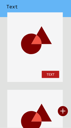
if the res/layout/activity_main.xml has
the following content :
<?xml version="1.0" encoding="utf-8"?>

<!-- res/layout/activity_main.xml -->

<LinearLayout xmlns:android="http://schemas.android.com/apk/res/android"
    xmlns:app="http://schemas.android.com/apk/res-auto"
    xmlns:tools="http://schemas.android.com/tools"
    android:layout_width="match_parent"
    android:layout_height="match_parent"
    android:orientation="vertical"
    tools:context=".MainActivity">

    <com.google.android.material.button.MaterialButton
        android:layout_width="match_parent"
        android:layout_height="wrap_content"
        android:textAppearance="?attr/textAppearanceHeadline6"
        app:shapeAppearance="?attr/shapeAppearanceSmallComponent"
        android:text="hello world"  />

    <com.google.android.material.button.MaterialButton
        android:layout_width="match_parent"
        android:layout_height="wrap_content"
        android:textAppearance="?MyHeadline6"
        app:shapeAppearance="@style/shapeAppearanceSmallComponent"
        android:text="hello world"  />

    <com.google.android.material.button.MaterialButton
        android:layout_width="match_parent"
        android:layout_height="wrap_content"
        android:textAppearance="?MyHeadline7"
        android:text="hello world"  />

    <SeekBar
        android:id="@+id/seekBar"
        android:layout_width="match_parent"
        android:layout_height="wrap_content" />

    <CalendarView
        android:id="@+id/calendarView"
        android:layout_width="match_parent"
        android:layout_height="wrap_content" />

    <SeekBar
        android:id="@+id/seekBar2"
        style="@style/Widget.AppCompat.SeekBar.Discrete"
        android:layout_width="match_parent"
        android:layout_height="wrap_content"
        android:max="10"
        android:progress="3" />

    <Switch
        android:id="@+id/switch1"
        android:layout_width="match_parent"
        android:layout_height="wrap_content"
        android:text="Switch" />

    <com.google.android.material.floatingactionbutton.FloatingActionButton
        android:id="@+id/floatingActionButton"
        android:layout_width="match_parent"
        android:layout_height="wrap_content"
        android:clickable="true"
        app:srcCompat="@android:drawable/ic_input_add" />


</LinearLayout>
Then the outcome will be the following :

Finally
as stated earlier ,
a theme can be set programmatically ,
using
the settheme method ,
as in the following code fragment .
import androidx .appcompat .app .AppCompatActivity;
import android .os .Bundle;

public class
        MainActivity
            extends AppCompatActivity {

    @Override
    protected void
            onCreate
                (Bundle savedInstanceState ){
        super .onCreate (savedInstanceState );
        setTheme (R .style .Theme_MaterialComponents_NoActionBar_Bridge );
        /* setTheme must be called before
           any views are instantiated in
           the Context , so for example
           before setContentView is
           called .*/
        setContentView (R .layout .activity_main ); } }
 Home
Home